

Printed Leggings in Lower Autumn Light: Check Pattern Contrast at Indoor Distance
Judge this galaxy print from the distance and lighting in which it will actually be seen, not from a bright close-up product image. After delivery, compare it at arm’s length and across the room under the intended indoor light; the result can describe pattern contrast, but not colourfastness, opacity, or body shaping.
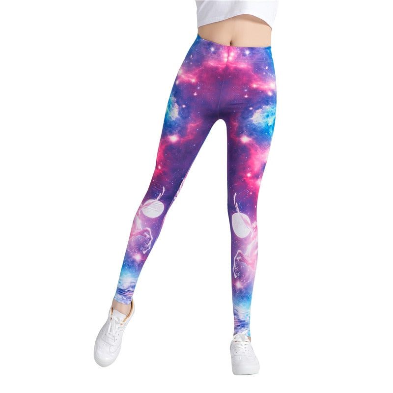
The print has three visual scales
At close range, the Star Space Galaxy Colorful Print Leggings show small star-like marks and multiple colour transitions. At conversational distance, those details combine into larger bright and dark zones. Across a room, the overall contrast is likely to lead—but the delivered garment and room lighting must decide, because a screen image is not a physical colour standard.
A repeatable October-light check
- Hang the leggings flat against the top or jacket planned for the outfit.
- View from about one arm’s length under the room’s daytime light.
- View from the far side of the room after the evening lights are on.
- Photograph both positions without a filter and note whether the print reads as detailed, blended, or high contrast.
Use the same top, distance, and room when comparing another outfit; otherwise the result is not comparable. This observation is about print visibility, not whether the fabric becomes transparent when stretched.
If the lower-light view loses too much detail for the intended outfit, use a plainer layer that does not compete with the galaxy pattern. If the contrast remains strong, keep the surrounding pieces visually quiet. The decision comes from the delivered print in the actual room.